
Visual Consistency on Social Media: Why It Wins the Scroll
By Hart & Highland · 5-minute read
After a while, you stop needing to see someone's username to know a post is theirs.
You recognize the font first. The color palette. The way the carousel is structured. The type of opening line they always use. Before you have consciously registered who posted it, your brain has already made the connection.
You know what you're about to get.
That's the power of visual consistency on social media. And it's easy to dismiss as branding. But on social, it does something much more useful: it makes content easier to process.
When your audience is scrolling while texting a friend, watching reality TV, checking Slack, waiting for coffee, and pretending to listen on Zoom, making something easier to process is a competitive advantage.
Key Takeaways
Recognition makes content easier to process. Familiar visual cues help audiences quickly identify a brand and understand what they're looking at.
Consistency doesn't mean sameness. Strong social media visual identities balance recognizable elements with enough flexibility to stay interesting.
Repeatable formats build familiarity. Recurring series, typography, and creative treatments help audiences associate certain content with specific value.
Clear design makes content more useful. Strong information hierarchy helps people understand, navigate, and remember a post.
Recognition builds over time. Consistent creative choices become more valuable as audiences encounter them repeatedly.
Why Does Visual Consistency Matter on Social Media?
Visual consistency helps audiences recognize content faster and understand what to expect from a brand. Familiar fonts, layouts, colors, and recurring formats create shortcuts that make content easier to process. In a crowded feed, that familiarity can help a post earn attention before someone has even read the caption.
Nobody opens Instagram ready to carefully assess every piece of content that enters the feed.
People are scanning.
Useful. Skip. Funny. Ad. Save that. Seen this before. Send to the group chat. Why am I still watching this?
Most of those decisions happen incredibly quickly. That means the first job of social creative is not always to impress someone. Sometimes it's simply to help them understand what they're looking at fast enough to care.
Recognizable visual patterns help.
A recurring series that actually looks recurring. A distinct treatment for educational content. A font, layout, framing device, or color choice that shows up often enough to become familiar.
Over time, those choices start functioning like shortcuts. The audience sees the format and already has an idea of the value proposition.
How Do You Build a Recognizable Social Media Visual Identity?
A recognizable social media visual identity comes from using consistent creative cues across content without making every post look identical. Recurring typography, photography styles, editing treatments, and content formats help establish familiarity, while variations in composition and storytelling keep the feed interesting.
This is where brands tend to overcorrect.
Visual consistency does not mean every post needs the same template, the same composition, or the exact same three brand colors arranged in slightly different orders forever.
A feed can be technically consistent and still feel completely forgettable.
The goal is recognition, not repetition.
The strongest social identities usually have enough structure to feel familiar and enough flexibility to stay interesting.
Think less "everything has to match" and more "everything should feel like it came from the same brain."
Some creators are especially good at this, often without ever calling it a visual system. Their trend breakdowns look like their trend breakdowns. Their recommendations have a recognizable rhythm. Their recurring series becomes identifiable before you even read the title.
Eventually, the format itself starts carrying meaning.
Why Recognizable Social Media Content Builds Familiarity
Recognizable social media content helps audiences connect familiar creative patterns with the value they expect to receive. When a brand repeatedly uses a distinct visual format to deliver useful or entertaining content, that format can become recognizable on its own, making future posts easier to identify and understand.
Spotify Wrapped is an obvious example.
Every year, the internet fills with variations of the same recognizable visual language. You rarely need someone to explain that they're sharing their Wrapped. The graphics tell you what you're looking at before you've processed a single statistic.
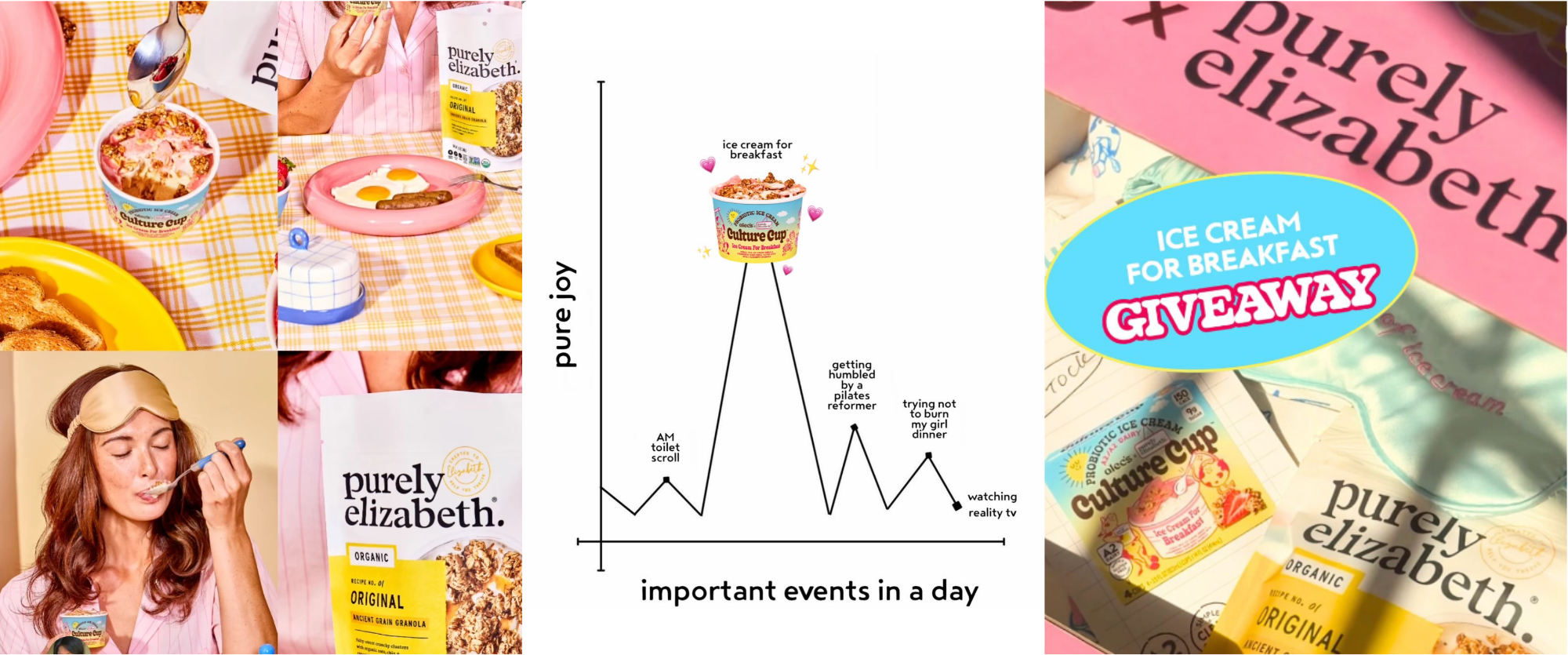
Take our client, Alec’s Ice Cream x Purely Elizabeth, for example. From its warm color palette and playful typography to its product photography and graphics, the brand creates content that feels cohesive without every post looking the same. You can recognize its content even as the formats change.
That familiarity creates speed. And speed matters on social.
When someone instantly understands what kind of post they're looking at, they can move faster to the more important question: Do I care?
Brands should be building that same kind of shorthand. Not necessarily at Spotify scale. But enough that an audience begins associating certain creative cues with certain kinds of value.
This is the series that teaches me something.
This is the post I usually save.
This is the brand that always explains this topic well.
That association is worth building.
How Social Media Content Design Makes Posts More Saveable
Effective social media content design makes information easy to find, understand, and revisit. Clear headlines, strong visual hierarchy, and familiar layouts help audiences quickly recognize a post's value. When content is useful and easy to navigate, it gives people a clearer reason to save it for later.
The posts people save are not always the most beautiful ones. They're often the ones that make themselves useful immediately. This Hart & Highland Q4 marketing calendar is a great example. It packs a ton of information into one visual, but the clear month-by-month layout makes it easy to navigate and revisit. It's the kind of resource people can save and come back to when they need it.
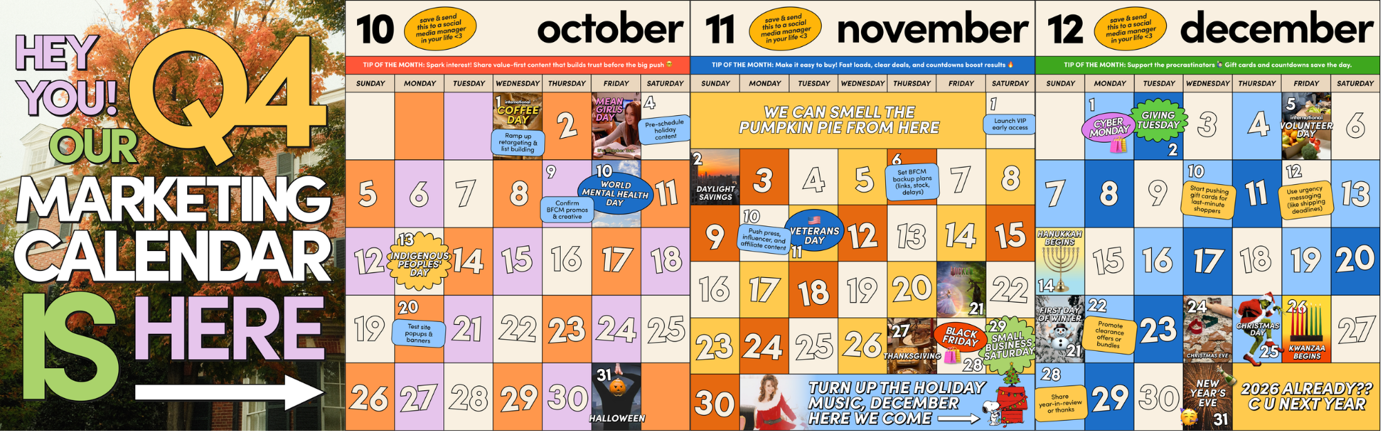
A strong cover tells you exactly what you're going to get. The hierarchy makes the information easy to scan. The format is familiar enough that you know how to navigate it.
There's very little friction between seeing the post and understanding why you might want it later.
That's design doing strategic work.
The prettier version of a confusing post is still a confusing post.
Especially as social becomes more crowded, brands have less time to make someone decode what they're looking at. Clear visual systems make content feel easier to enter, easier to understand, and easier to remember.
How Consistent Social Media Branding Builds Recognition Over Time
Consistent social media branding builds recognition through repeated exposure to familiar creative elements. A single post may not establish a strong association, but recurring visual cues paired with valuable content can help audiences remember a brand and recognize its posts more easily over time.
One recognizable post probably won't transform a brand.
Fifty might.
Because consistency works through accumulation.
The same visual cues appear again. The same series delivers something useful again. The audience sees the format enough times that recognition becomes automatic.
Eventually, someone doesn't need to read the username.
They already know.
That's when a visual identity stops being decoration and starts becoming an asset. Our client OLIPOP is a great example of how consistency can show up across different campaigns. Whether it's a seasonal activation or everyday product content, the brand's bold colors, playful styling, and recognizable product imagery create a distinct visual identity that carries through.
The goal isn't to make every post look identical. It's to create enough familiarity that, in a feed full of things competing for attention, your audience knows when they've landed on something worth paying attention to.

Frequently Asked Questions
What is visual consistency on social media?
Visual consistency on social media means using recognizable design elements, creative styles, and content formats across a brand's posts. These elements might include typography, colors, photography, editing styles, or recurring series. The goal is to make content feel connected and identifiable without making every post look the same.
Does every social media post need to follow the same template?
No. Visual consistency doesn't require every post to use the same template or layout. Brands can experiment with trends, formats, and creative concepts while maintaining recognizable elements that connect their content.
How can brands make their social media content more recognizable?
Brands can make their content more recognizable by developing a few repeatable visual and editorial cues. Consistent typography, distinctive photography, recurring series, and familiar headline treatments can all help. The key is using those elements frequently enough for audiences to begin associating them with the brand.
Why is visual hierarchy important in social media content?
Visual hierarchy helps audiences understand which information matters most and where to look first. Clear headlines, thoughtful layouts, and easy-to-scan content reduce the effort required to understand a post. This is especially useful for educational carousels, tips, and other information-heavy content.
How does visual consistency fit into a social media content strategy?
Visual consistency gives a social media content strategy a recognizable creative foundation. It connects different content pillars, campaigns, and recurring series through a shared identity, while allowing individual posts to serve different purposes. The result is a feed that feels cohesive without sacrificing variety.
At Hart & Highland, we believe strong social content should be recognizable, useful, and worth paying attention to.
Want more thoughts on the creative decisions shaping social? Subscribe to Thursday Thrill for our latest perspectives.